Drowning in Gill Button's Paintings
How the art of Gill Button forces us to confront ourselves in our image-obsessed world
“Who among us has not, by chance, looked in the mirror and felt surprised? For a fraction of a second we see ourselves as an object to be looked at. Some might call it narcissism, but I would call it: the joy of being. The joy of finding in our external face echoes of our internal face: ah, so it’s true, I didn’t imagine myself, I actually exist.” -Clarice Lispector (Too Much of Life)
In my recent search through old photographs, I found a few of myself as a baby and child. I hate being photographed. It’s not that I’m self-conscious, I’m just not photogenic. This is an unfortunate trait to have in the age of TikTok and Instagram, but it’s one I’ve long accepted.
In the early 2000s, when I was a tween, we turned our new digital cameras around toward our faces, holding them at a high angle in the hopes of getting an ideal look. After several snaps, we over-edited them on Piknik and posted them to an album on Facebook.
Chloe Wise, who we’re not talking about today (but will someday soon), spoke on the Great Women Artists Podcast about the nature of cropping photos to center on ourselves. This interested her and inspired many of her compositions.
I have mixed feelings about how artists today discuss the topic of social media and cell phones. This is largely due to political cartoons or faux 'deep art’ that frequently circulates. The problem with this kind of ‘art’ or ‘critique’ is it’s always too slow and never ‘deep enough.’ That, and social media is constantly changing.
I could write a novel critiquing TikTok, but by the time it’s edited, polished, and published (which can take years as I don’t have a literary agent anymore), the world may have already moved on from the app. Or, whatever I had to say may be either ‘old hat’ or ‘yesterday’s news.’
This presents a unique challenge to artists and writers, who are in a position to specially critique our contemporary world. Their perspective is necessary, but how do you get your point across in a fast-paced world that is constantly changing? If you don’t agree with what I’m saying, last year everyone I knew was saying ‘delulu.’ Yet, quickly, ‘delulu’ has been criticized as a problematic term. We switched gears on this in less than a year. I’m not saying that’s bad, there are a lot of benefits to this, but like I said, this presents a challenge for creatives.
It’s for this reason I find British Artist Gill Button so compelling. I’ve been a fan of hers for years but was delighted to see her work flooding Instagram in more recent years thanks to her painting being aptly placed on the cover of Cleopatra & Frankenstein by Coco Mellors. Not only does her work pair perfectly with the book, but her paintings were used for both the UK and US covers. The book took off in the UK and sadly has yet to gain as much traction in the US. The paperback was going to have a change of cover to match the style of the UK before being changed to the UK paperback cover, perhaps an attempt by the publisher to garner more attention. And, for the record, it absolutely deserves more attention.
But we’re not here to talk about books. We’re here to talk about art.
I’ve become a collector of books with Gill Button’s art, which also includes Checkout 19 by Claire-Louise Bennett (again the UK edition) (yes I bought the UK edition) (sue me). Her work graces the UK edition of Blue Sisters, only available in the UK (yes I desperately want it) (but Waterstones doesn't want me to want it) (sue them) (not really).
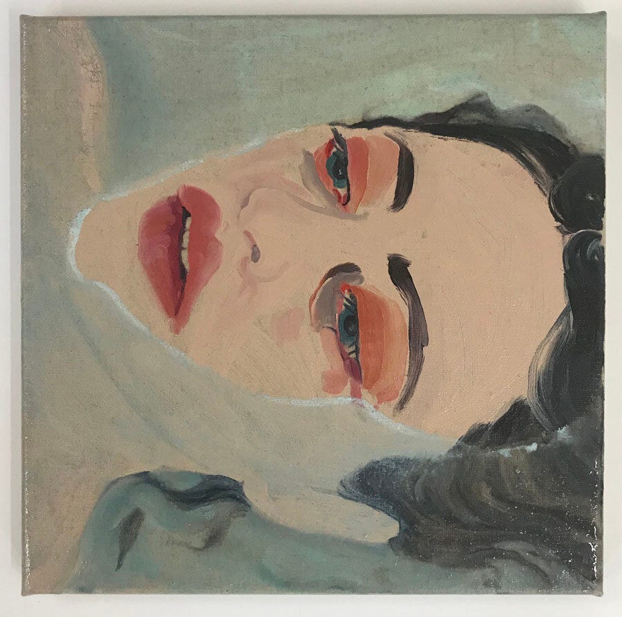
“I like my subjects to have a relationship, firstly with me and then with other people, so most of my characters are looking right at you, demanding you engage with them. I always start with the eyes, if I’m not happy with how they are looking there is no point for me carrying on – I’ll wipe the canvas and start again!” - Gill Button
For me, someone who cannot afford to buy the art of contemporary artists she loves, my favorites on book covers are a treasure trove. Andy Dixon, Anna Weyant, and Jessica Miller have all had their art put on book covers. I’ve bought nearly all of them, and I display them in my room. I even got a subscription to The New Yorker because I found out an artist I loved did a cover for them. (and I wanted to believe I would actually sit down and read the stories) For the record, I only ever got one New Yorker cover with her art on it.
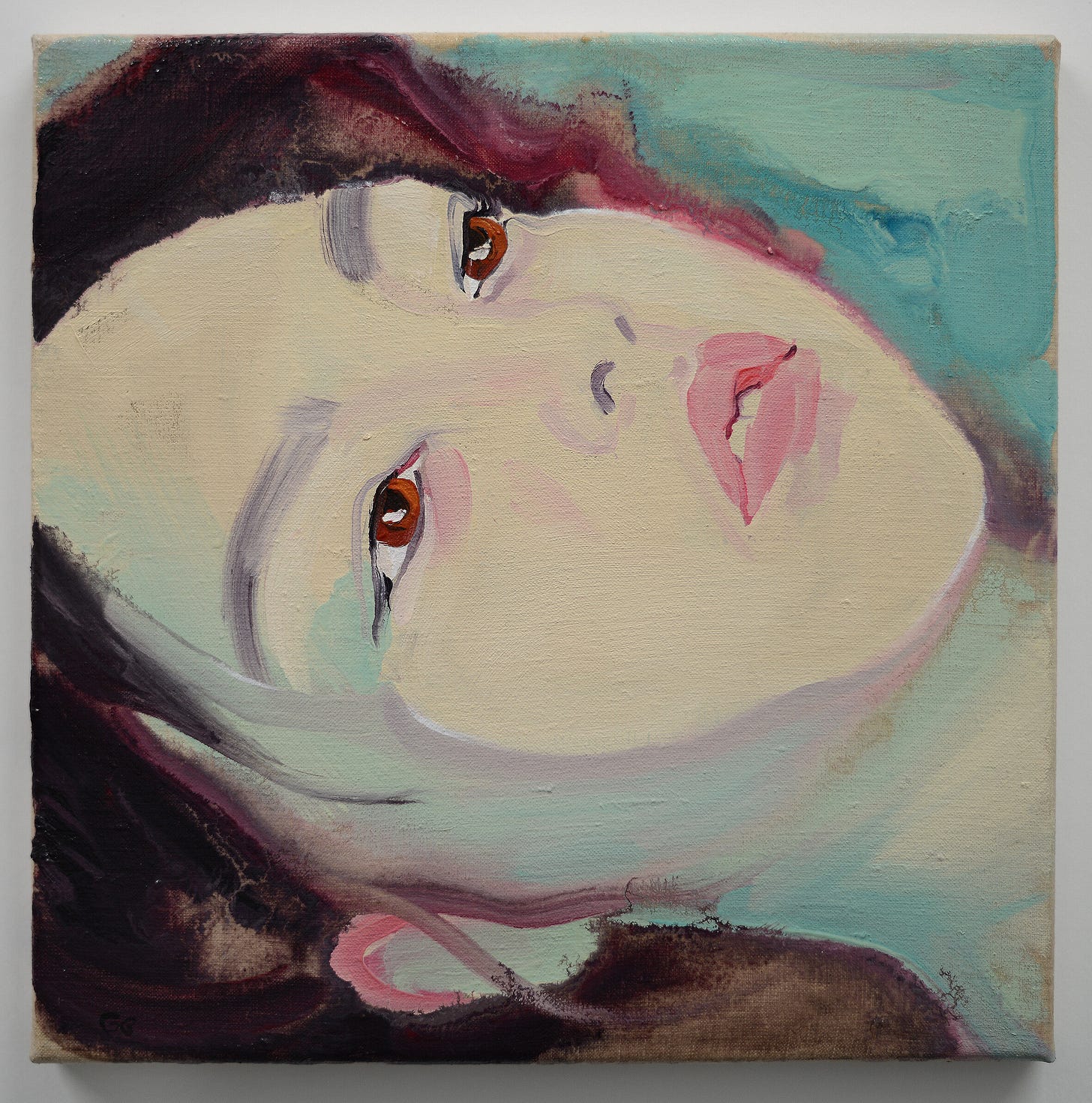
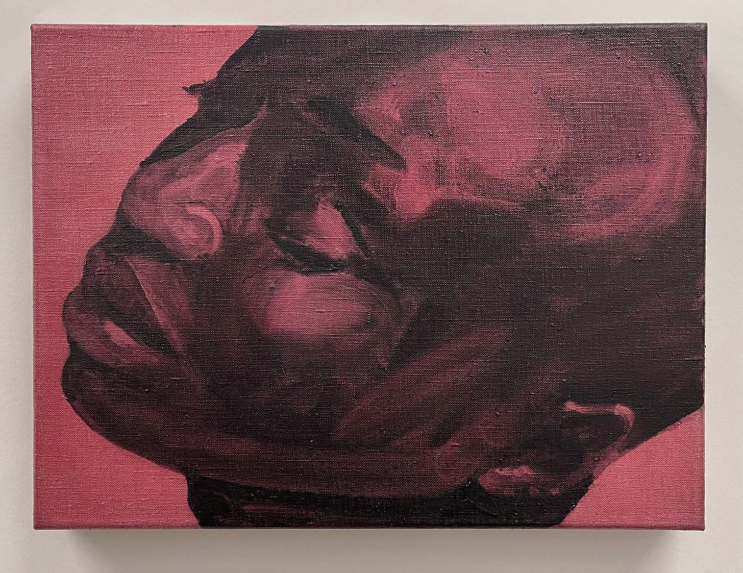
I’m not surprised publishers are apt to put Button’s work on book covers. Gill Button draws you in, enchanting you with her paintings that seem so fresh that even from a computer screen you think they must not be dry yet. Her hyper-close-ups are uncomfortable but compelling. Somehow, we cannot look away.
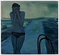
Her work dares us to imprint on it. As I said, they feel fresh, and so do the emotions crossing the subjects. By nature, we force our own emotions onto her work. Often her work focuses on women, including women who seem to be almost drowning, if not in literal water then in the emotions playing across their faces. In this way, her drowning women wrap around our hearts and squeeze.
Button’s work exudes a ‘fragile vulnerability,’ an excellent phrase she used herself. The last artist I spoke of worked on a large scale, zooming in on details. Button, on the other hand, works on a small scale, focusing primarily on the face. While she does have large-scale work (and they’re gorgeous), most of her work consists of small portraiture.
Weirdly enough, when I first encountered Button’s work my initial thought was, “juicy.” I was fascinated, looking over every piece on her website and zooming in. I wanted to achieve this look in my own work. I realize it sounds funny, but I love paintings that feel juicy. Maybe it’s because I live in a desert and moisturize to near excess. Largely I think it was just a natural extension of my curiosity with oil paint, which most of her paintings are done in.
Every time I look at Button’s work, I find something else that surprises me. Her paint streaks don’t disappear, sometimes they appear thick and swift. There’s almost a sense that she did this in a few quick confident brush strokes. They don’teven fully cover the background. Sometimes the dark background of her canvas is still visible on the faces of her subjects. There’s an urgency and sense of movement to her work that only comes from swift confidence.
Where then does her work relate to social media? This tidbit from her latest exhibition (named after a French New Wave Film), puts it best:
“Gill Button’s paintings respond to the constant stream of images we encounter daily, articulating the split second of identification where an image touches a nerve and captures a complex of feelings.” - ArtFacts
Her images are constant, almost excessive. There are so many of these tiny paintings, so many faces. In a world of so many images - so many attractive images - in our faces, how does that change us? We already know this answer, even the parts we don’t like to admit. We know what a smize is, we know our best angles in photos, and we’ve coined a term for this: looksmaxxing.
Yet, I don’t think it’s fair to say that Gill Button is critical of this. I think she’s merely asking us to confront this. She’s worked with Gucci, for starters. I don’t say that as a critique either. Frankly, working with Gucci is a dream. I think, rather, Gill Button’s work gets down to the bare bones of our image-obsessed society. I think she presents a mirror to us, and we do the rest of the work without realizing it.
No matter how many times I Instagram-stalk her, I always come back to her drowned women. What is it about them that draws me in? I realize, soon enough, that I am these women. I’m drowning in this digital world. I, like those in Button’s painting, am gasping for air amid the chaos of our modern days. I look at her paintings, and I see, to my surprise, myself.


A new artist for me. Her work is amazing! I love that you began this piece with that incredible insight from Clarice Lispector.